How Far Away Can a Billboard Be Read?
One of the most overlooked yet critical aspects of billboard advertising is readability distance—how far away a billboard can be seen and understood. A billboard that cannot be read quickly or from a sufficient distance fails its primary purpose, regardless of how creative or well-designed it is.
Billboard readability depends on multiple factors, including size, placement, font choice, color contrast, viewing angle, and audience speed. This article explores how far away billboards can be read, what influences visibility, and how advertisers can design billboards that communicate effectively at a distance.
Understanding Billboard Readability
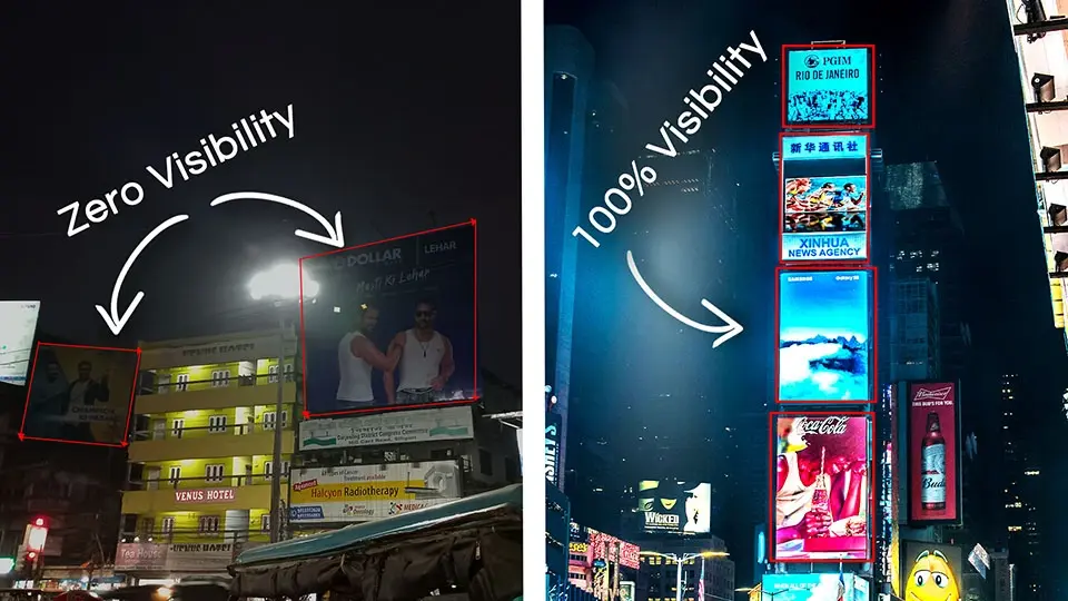
Visibility vs Readability
It’s important to distinguish between:
-
Visibility: Whether a billboard can be seen
-
Readability: Whether the message can be read and understood
A billboard may be visible from far away but unreadable due to poor design.
Why Readability Matters
Most viewers:
-
Are moving (driving or walking)
-
Have limited time to process information
If the message isn’t clear instantly, it’s lost.
Average Readability Distances for Billboards
General Distance Guidelines
Typical readability ranges:
-
300–500 feet for standard roadside billboards
-
500–1,000 feet for large-format bulletins
-
100–300 feet for posters and smaller formats
These are estimates and depend on conditions.
Highway vs Urban Viewing Distances
Highway billboards:
-
Are read from farther away
-
Require larger text and simpler messages
Urban billboards:
-
Are read closer
-
Allow slightly more detail
Billboard Size and Its Impact on Readability
Standard Billboard Sizes
Common sizes include:
-
14’ x 48’ bulletins
-
12’ x 24’ posters
-
Digital equivalents
Larger billboards allow greater viewing distance.
Size-to-Distance Ratio
A common rule:
-
1 inch of letter height per 10 feet of viewing distance
For example:
-
12-inch letters = ~120 feet readability
-
24-inch letters = ~240 feet readability
Font Size and Letter Height
Recommended Letter Heights
For readability:
-
Headlines: 18–48 inches
-
Secondary text: minimal or avoided
Small text fails at speed.
Uppercase vs Lowercase Letters
Mixed-case text:
-
Is easier to read
-
Improves word recognition
All caps reduce legibility at distance.
Font Style and Typeface Selection
Best Fonts for Billboards
Ideal billboard fonts are:
-
Sans-serif
-
Bold
-
Simple
Examples include clean, geometric styles.
Fonts to Avoid
Avoid:
-
Script fonts
-
Decorative typefaces
-
Thin or condensed fonts
They reduce clarity from a distance.
Color Contrast and Readability
High Contrast Improves Distance Reading
Effective combinations include:
-
Black on yellow
-
White on dark blue
-
Black on white
Low contrast reduces visibility.
Avoiding Color Clutter
Too many colors:
-
Distract the eye
-
Reduce message clarity
Simple palettes work best.
Viewing Angle and Line of Sight
Straight-On Visibility
Billboards are easiest to read when:
-
Facing traffic directly
-
Positioned perpendicular to the road
Sharp angles reduce effective distance.
Obstructions and Visual Noise
Trees, buildings, and other signs:
-
Block sightlines
-
Shorten readable distance
Clear line of sight is essential.
Speed of the Audience
How Speed Affects Readability
Faster-moving viewers:
-
Have less time
-
Need simpler messages
Highway drivers need larger text and fewer words.
Urban Traffic Conditions
Slower traffic:
-
Allows slightly more reading time
-
Still requires simplicity
Don’t assume stopped traffic equals attention.
Digital Billboards and Readability Distance
Brightness and Clarity
Digital billboards:
-
Are visible from farther distances
-
Maintain clarity in low light
Brightness enhances visibility, not complexity.
Motion and Readability
Minimal motion:
-
Preserves readability
-
Prevents distraction
Static frames work best.
Lighting and Time of Day
Daytime Visibility
Sunlight:
-
Can wash out colors
-
Requires high contrast
Design must account for glare.
Nighttime Readability
At night:
-
Illumination improves contrast
-
Overbrightness can cause glare
Balanced lighting is key.
Environmental Conditions
Weather Effects
Rain, fog, and snow:
-
Reduce visibility
-
Shorten readable distance
Design should account for worst conditions.
Seasonal Changes
Foliage growth:
-
Can block views
-
Reduce effective distance
Seasonal planning matters.
Message Length and Word Count
Fewer Words = Greater Distance
The fewer the words:
-
The easier the message is to read
-
The farther it can be understood
Six to eight words is ideal.
Avoiding Secondary Information
URLs, phone numbers, and fine print:
-
Reduce readability
-
Should be minimal
Focus on one takeaway.
Brand Recognition at a Distance
Logos vs Text
Logos:
-
Are recognized from farther away
-
Work even when text is unreadable
Strong branding improves distance impact.
Familiar Brands Travel Farther
Well-known brands:
-
Require less text
-
Are recognized instantly
Recognition extends effective distance.
Measuring Billboard Readability
On-Site Evaluation
Advertisers assess:
-
Drive-by readability tests
-
Viewing angles
Real-world testing is valuable.
Traffic Engineering Metrics
Traffic studies estimate:
-
Viewing time
-
Distance of exposure
These help predict performance.
Common Readability Mistakes
Avoid:
-
Small fonts
-
Low contrast
-
Excessive text
-
Poor placement
These drastically reduce effective distance.
Designing for Maximum Readability
Best practices include:
-
One message
-
Large fonts
-
Strong contrast
-
Clean layout
Design should prioritize distance comprehension.
Differences Between Static and Digital Readability
Static Billboards
Static boards:
-
Depend on lighting conditions
-
Require optimal color contrast
Digital Billboards
Digital boards:
-
Maintain consistent brightness
-
Improve night visibility
But still require simple messaging.
Urban vs Highway Readability Strategy
Highway Strategy
Focus on:
-
Large headlines
-
Minimal text
-
Brand recognition
Urban Strategy
Allows:
-
Slightly more detail
-
Contextual messaging
But clarity still comes first.
The Relationship Between Readability and Recall
Clear, readable billboards:
-
Increase message retention
-
Improve brand recall
Unreadable ads are forgotten.
Long-Term Impact of Good Readability
Over time:
-
Readable billboards build familiarity
-
Familiarity builds trust
Consistency enhances effectiveness.
Conclusion
The distance at which a billboard can be read depends on size, font, color contrast, placement, and audience speed. While large billboards may be visible from hundreds of feet away, true effectiveness comes from ensuring the message is readable and understandable within seconds.
By designing for distance, simplicity, and clarity, advertisers can maximize the impact of their billboards and ensure their message reaches audiences before they pass by.
- Arts
- Business
- Computers
- Games
- Health
- Home
- Kids and Teens
- Money
- News
- Personal Development
- Recreation
- Regional
- Reference
- Science
- Shopping
- Society
- Sports
- Бизнес
- Деньги
- Дом
- Досуг
- Здоровье
- Игры
- Искусство
- Источники информации
- Компьютеры
- Личное развитие
- Наука
- Новости и СМИ
- Общество
- Покупки
- Спорт
- Страны и регионы
- World