How Do I Design an Effective Billboard Ad?
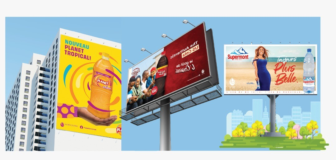
Designing a billboard ad is very different from designing ads for digital, print, or social media. A billboard is not meant to be studied—it is meant to be glimpsed. Most viewers see a billboard for only a few seconds while driving, walking, or commuting. In that short moment, the design must communicate a message clearly, memorably, and without confusion.
An effective billboard ad combines strong layout, concise messaging, strategic color use, and readable typography. Poor design choices can make even the most expensive billboard invisible or forgettable. This article explains the core principles of billboard design and how advertisers can create outdoor ads that truly work.
Why Billboard Design Is Unique
Billboard design operates under strict constraints:
-
Limited viewing time
-
Long viewing distances
-
Distracted audiences
-
Large physical scale
These factors require a minimalist, intentional design approach.
The Primary Goal of Billboard Design
The goal is not to explain everything.
The goal is to:
-
Capture attention
-
Communicate one idea
-
Trigger recall or action
Clarity beats complexity every time.
The Rule of Simplicity
Why Less Is More in Billboard Advertising
Billboards are not brochures.
An effective billboard usually:
-
Focuses on one message
-
Avoids unnecessary details
-
Uses minimal text
Too much information overwhelms the viewer.
The “6–8 Word Rule”
A widely used guideline:
-
Limit copy to 6–8 words
This ensures readability at speed.
Layout Best Practices for Billboard Ads
What Is Layout in Billboard Design?
Layout refers to:
-
Placement of text
-
Position of images
-
Use of empty space
Good layout directs the eye naturally.
Visual Hierarchy
An effective billboard has a clear hierarchy:
-
Primary message or headline
-
Supporting visual
-
Brand or call-to-action
The viewer should understand the message instantly.
The Importance of White Space
White (or empty) space:
-
Improves readability
-
Prevents clutter
-
Draws attention to key elements
Crowded billboards fail quickly.
Center vs Offset Layouts
Center-aligned layouts:
-
Work well for bold statements
Offset layouts:
-
Add visual interest
-
Guide the eye across the design
Choose based on message clarity.
Messaging Best Practices
Focus on One Core Message
Every billboard should answer:
-
“What is this about?”
If the message cannot be understood in seconds, it is too complex.
Emotional vs Informational Messaging
Billboards perform best when they:
-
Trigger emotion
-
Spark curiosity
-
Reinforce brand identity
They are not ideal for detailed explanations.
Brand Recognition Matters
Your brand should be:
-
Visible
-
Recognizable
-
Consistently styled
However, branding should not overpower the message.
Color Best Practices for Billboards
Why Color Matters More Outdoors
Outdoor environments are visually noisy.
Effective billboard colors must:
-
Stand out against the sky, buildings, and traffic
-
Remain readable in daylight and at night
Color choice directly affects visibility.
High Contrast Is Essential
Use high-contrast combinations:
-
Dark text on light background
-
Light text on dark background
Low contrast reduces legibility.
Avoid Color Overload
Using too many colors:
-
Distracts the viewer
-
Weakens focus
Two or three dominant colors is ideal.
Consider Environmental Colors
Billboards should contrast with:
-
Trees
-
Buildings
-
Sky
-
Road surfaces
Blending in defeats the purpose.
Font and Typography Best Practices
Font Readability Is Critical
Fonts must be:
-
Large
-
Simple
-
Easy to read from a distance
Decorative fonts often fail outdoors.
Sans-Serif Fonts Work Best
Common billboard-friendly fonts:
-
Helvetica-style fonts
-
Bold sans-serif families
They maintain clarity at scale.
Font Size and Distance
General guideline:
-
One inch of letter height per 10 feet of viewing distance
Large formats require oversized text.
Limit Font Variety
Use:
-
One font family
-
Possibly two weights (bold/regular)
Multiple fonts create confusion.
Image Use in Billboard Design
Images Should Support the Message
Images must:
-
Be simple
-
Be relevant
-
Be instantly recognizable
Complex images lose impact.
Avoid Small Details
Fine details disappear at distance.
Use:
-
Bold shapes
-
Clear subjects
-
Strong focal points
If it cannot be understood quickly, it should not be used.
Faces and Human Elements
Faces often:
-
Draw attention
-
Create emotional connection
However, they must be large and clear.
Logo Placement and Branding
Where Should the Logo Go?
Common placements:
-
Bottom corner
-
Side edge
The logo should be visible but not dominant.
Logo Size Matters
Logos that are too small:
-
Lose recognition
Logos that are too large:
-
Distract from the message
Balance is key.
Call-to-Action (CTA) Best Practices
Should Billboards Have CTAs?
Yes—but they must be simple.
Effective CTAs include:
-
Short URLs
-
Brand names
-
Simple actions
Avoid long instructions.
Digital-Friendly CTAs
Because users cannot click:
-
Use memorable website names
-
Use QR codes sparingly
-
Use short, easy-to-recall phrases
Simplicity wins.
Designing for Traffic Speed
High-Speed Roads
For highways:
-
Larger fonts
-
Fewer words
-
Bold visuals
Messages must be absorbed instantly.
Low-Speed or Pedestrian Areas
In slower environments:
-
Slightly more detail is acceptable
-
Smaller formats can still be effective
Context matters.
Static vs Digital Billboard Design
Static Billboard Design
Static billboards require:
-
One strong message
-
Consistent visibility
They rely on repetition over time.
Digital Billboard Design
Digital billboards require:
-
Even simpler messaging
-
Fewer words
-
Strong contrast
Multiple advertisers share screen time.
Animation and Transitions
If animation is allowed:
-
Keep it subtle
-
Avoid fast movement
Over-animation reduces readability.
Testing Billboard Designs Before Launch
Mockups and Distance Testing
Designs should be:
-
Viewed at scale
-
Tested from distance
If it fails the distance test, revise it.
Ask One Key Question
Show the design briefly and ask:
-
“What did you remember?”
If the answer matches your goal, the design works.
Common Billboard Design Mistakes
Avoid:
-
Too much text
-
Small fonts
-
Poor contrast
-
Overcrowded layouts
-
Trying to explain everything
These mistakes reduce effectiveness.
Consistency Across Campaigns
Billboard design should align with:
-
Brand identity
-
Other advertising channels
Consistency builds recognition.
Legal and Compliance Considerations
Design must comply with:
-
Local regulations
-
Platform guidelines
Some content or imagery may be restricted.
Adapting Designs for Different Billboard Sizes
Designs should be:
-
Reworked for each size
-
Not simply resized
Scaling without adaptation leads to poor readability.
The Role of Creativity in Billboard Design
Creativity matters, but:
-
Clarity comes first
-
Creativity should support the message
The best designs are both bold and simple.
Measuring Design Effectiveness
Good billboard design leads to:
-
Better recall
-
Increased brand searches
-
Higher response rates
Design quality affects ROI.
Conclusion
Designing an effective billboard ad requires a clear understanding of how people view outdoor advertising. With limited time and distance constraints, successful billboard design prioritizes simplicity, strong layout, high contrast colors, readable fonts, and focused messaging.
Every element—from font choice to color palette—must serve the central message. When done correctly, billboard design turns a fleeting glance into a lasting impression. By following proven layout, messaging, color, and typography principles, advertisers can ensure their billboard ads stand out, communicate clearly, and deliver real results.
- Arts
- Business
- Computers
- Jogos
- Health
- Início
- Kids and Teens
- Money
- News
- Personal Development
- Recreation
- Regional
- Reference
- Science
- Shopping
- Society
- Sports
- Бизнес
- Деньги
- Дом
- Досуг
- Здоровье
- Игры
- Искусство
- Источники информации
- Компьютеры
- Личное развитие
- Наука
- Новости и СМИ
- Общество
- Покупки
- Спорт
- Страны и регионы
- World