
Inflation graphs
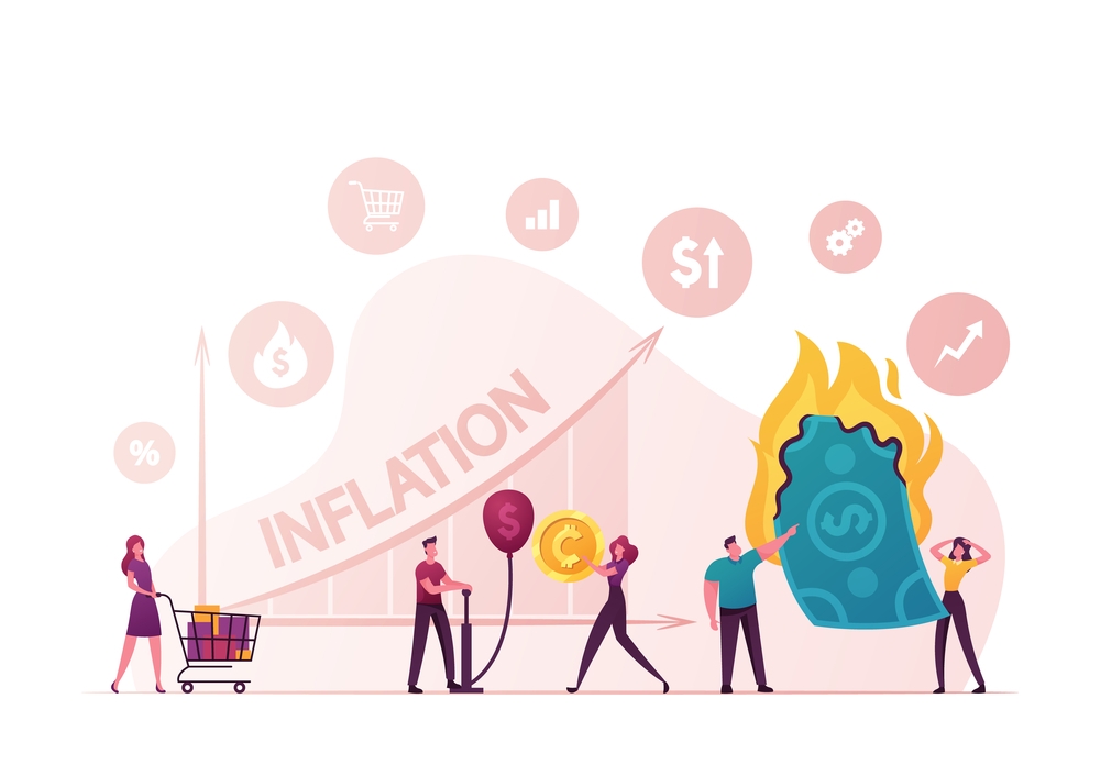
Inflation Graphs: Understanding Price Changes Through Visual Data
Inflation graphs are one of the most effective tools for understanding how prices change over time. Instead of reading long tables of numbers, graphs allow economists, policymakers, businesses, and consumers to quickly identify trends, compare periods, and evaluate the impact of inflation on an economy.
What Is an Inflation Graph?
An inflation graph is a visual representation of inflation data over a specific period. It typically shows how the inflation rate changes month by month, quarter by quarter, or year by year. Most inflation graphs use data collected through price indexes such as the Consumer Price Index (CPI).
A typical inflation graph has:
-
Horizontal axis (X-axis): Time (months or years)
-
Vertical axis (Y-axis): Inflation rate (percentage)
-
Trend line or bars: Showing increases or decreases in inflation over time
Example Trend
Note: The chart above uses illustrative values for educational purposes rather than official statistics.
Why Inflation Graphs Matter
Inflation graphs simplify complex economic information and help users:
-
Identify long-term inflation trends
-
Compare inflation across different periods
-
Detect periods of unusually high or low inflation
-
Support economic forecasting
-
Evaluate the effects of government and central bank policies
Because visual trends are easier to interpret than raw numbers, inflation graphs are commonly used in economic reports and financial news.
Common Types of Inflation Graphs
1. Line Graphs
Line graphs are the most widely used format because they clearly show how inflation changes over time. Rising lines indicate increasing inflation, while falling lines indicate slowing inflation.
2. Bar Charts
Bar charts compare inflation rates between different months, years, or countries. They are useful when highlighting differences rather than continuous trends.
3. Combined Charts
Some reports combine inflation with other indicators such as:
-
Interest rates
-
Wage growth
-
GDP growth
-
Unemployment
These comparisons help explain how inflation interacts with other parts of the economy.
How to Read an Inflation Graph
Reading an inflation graph involves several simple steps:
-
Identify the time period shown on the horizontal axis.
-
Check the inflation rate scale on the vertical axis.
-
Observe whether the trend is rising, falling, or stable.
-
Look for sudden spikes or sharp declines.
-
Consider major economic events that may explain changes.
For example, a sharp increase could reflect supply shortages or higher energy prices, while a gradual decline may indicate successful inflation-control measures.
What Causes Changes in Inflation Graphs?
Several economic factors influence inflation trends, including:
Demand-Pull Inflation
When consumer demand grows faster than production, prices increase. This creates an upward trend on inflation graphs.
Cost-Push Inflation
Higher production costs, including wages or raw materials, often force businesses to raise prices.
Monetary Policy
Lower interest rates encourage borrowing and spending, which may increase inflation. Higher interest rates often reduce inflation over time.
Supply Chain Disruptions
Natural disasters, transportation problems, or geopolitical events can reduce supply and temporarily increase prices.
Energy Prices
Oil and gas prices have a significant influence on transportation and manufacturing costs, affecting inflation across many sectors.
Interpreting Different Patterns
Different graph patterns tell different economic stories.
Steady Upward Trend: Inflation is gradually increasing.
Sharp Spike: Temporary events or economic shocks may have pushed prices higher.
Rapid Decline: Inflation is slowing, possibly due to tighter monetary policy or improving supply conditions.
Flat Line: Prices are relatively stable, often reflecting low and predictable inflation.
Inflation Graphs and Decision-Making
Governments
Governments monitor inflation graphs to evaluate fiscal policies and determine whether intervention is needed.
Central Banks
Central banks use inflation graphs when deciding whether to raise or lower interest rates to maintain price stability.
Businesses
Companies use inflation trends to:
-
Set product prices
-
Estimate future costs
-
Plan investments
-
Negotiate wages
Investors
Investors analyze inflation graphs to anticipate interest-rate changes and adjust investment portfolios accordingly.
Consumers
Households use inflation information to:
-
Budget more effectively
-
Plan major purchases
-
Understand changes in living costs
Inflation Graphs Around the World
Many countries publish inflation graphs regularly using official statistical agencies. Although calculation methods may differ slightly, the general purpose remains the same: measuring changes in consumer prices over time.
International organizations also compare inflation across countries, helping economists identify global trends and regional differences.
Limitations of Inflation Graphs
Although useful, inflation graphs have limitations.
-
They summarize broad price movements rather than individual spending patterns.
-
Inflation may affect households differently depending on income and spending habits.
-
Short-term fluctuations do not always indicate long-term economic changes.
-
Different price indexes may produce slightly different results.
For these reasons, inflation graphs should be interpreted alongside other economic indicators.
Best Practices for Using Inflation Graphs
To gain meaningful insights:
-
Examine long-term trends instead of focusing only on monthly changes.
-
Compare inflation with employment, wages, and economic growth.
-
Understand the events occurring during periods of major changes.
-
Use official statistical sources whenever possible.
-
Consider both headline and core inflation when available.
Conclusion
Inflation graphs transform economic data into clear, easy-to-understand visuals that reveal how prices change over time. Whether displayed as line graphs, bar charts, or combined with other economic indicators, they help governments, businesses, investors, and consumers make informed decisions.
By learning how to interpret inflation graphs, readers can better understand economic conditions, recognize important trends, and appreciate the factors that influence the cost of living. While no graph tells the entire economic story, inflation graphs remain among the most valuable tools for tracking price stability and understanding the health of an economy.
Illustrative inflation trend
Example annual inflation rate over six years.
| inflation | year |
|---|---|
| 2.1 | 2021 |
| 6.8 | 2022 |
| 5 | 2023 |
| 3.4 | 2024 |
| 2.8 | 2025 |
| 2.4 | 2026 |
- Arts
- Business
- Computers
- Spellen
- Health
- Home
- Kids and Teens
- Money
- News
- Personal Development
- Recreation
- Regional
- Reference
- Science
- Shopping
- Society
- Sports
- Бизнес
- Деньги
- Дом
- Досуг
- Здоровье
- Игры
- Искусство
- Источники информации
- Компьютеры
- Личное развитие
- Наука
- Новости и СМИ
- Общество
- Покупки
- Спорт
- Страны и регионы
- World

 English
 Russian
 French
 Spanish
 Portuguese
 Deutsch
 Turkish
 Italiano
 Arabic
 Romaian
 Portuguese (Brazil)
 Greek
Greek